Over the last few months, I have used org-mode more and more for writing and programming in Emacs. I love its flexibility and power, and it is the first literate programming tool which “feels right”, and I have been able to stick with it for a longer period of time than in my previous attempts.
Recently I started thinking about how I could make my editing environment more visually appealing. I am in general very happy with my Emacs’ appearance. I use the Gruvbox theme (in the meantime I have switched to the light Spacemacs theme) and org-mode has very decent syntax highlighting. But as I write more and more prose in Emacs these days, I started thinking it might be nice to edit text in more visually-appealing fonts, including using a proportional font, which makes regular prose much more readable. I would like to share with you what I learned and my current Emacs configuration.
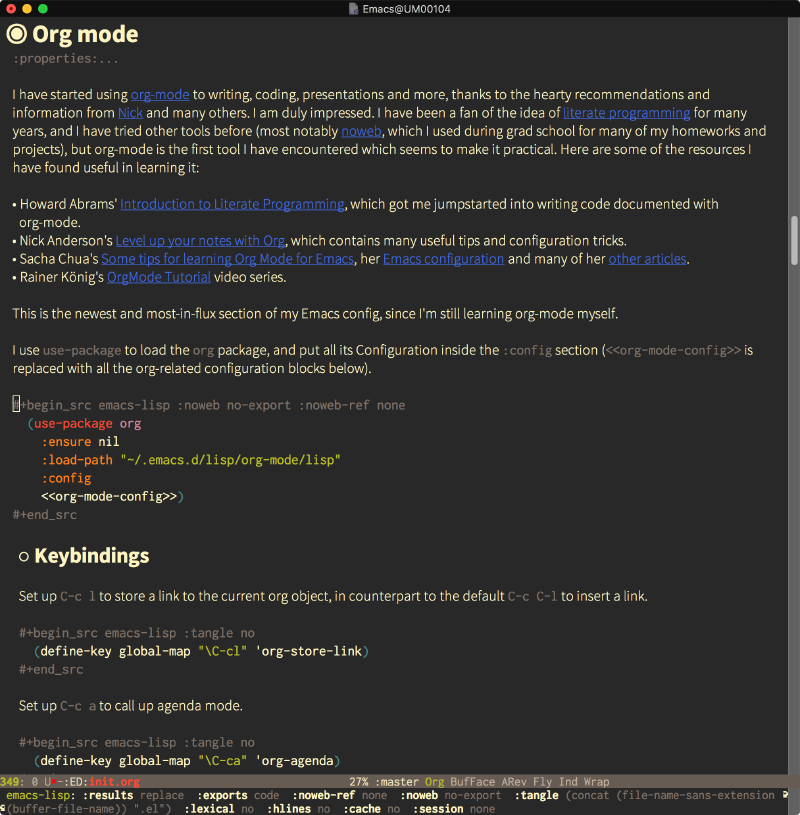
In the end, you can have an Emacs setup for editing org documents which looks very nice, with proportional fonts for text and monospaced fonts for code blocks, examples and other elements. To wet your appetite, here is what a fragment of my init.org file looked like with the Gruvbox theme:

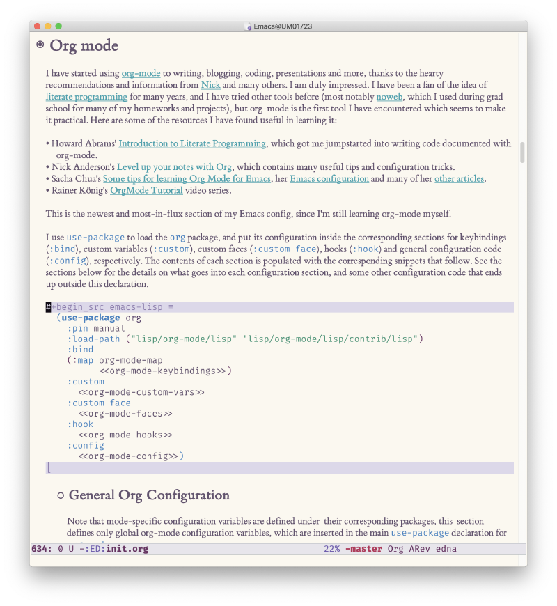
And this is how it looks now with the light Spacemacs theme:

Step 1: Configure faces for Org headlines and lists#
My first step was to make org-mode much more readable by using different fonts for headings, hiding some of the markup, and improving list bullets. I took these settings originally from Howard Abrams’ excellent Org as a Word Processor article, although I have tweaked them a bit.
First, we ask org-mode to hide the emphasis markup (e.g. /.../ for italics, *...* for bold, etc.):
(setq org-hide-emphasis-markers t)Then, we set up a font-lock substitution for list markers (I always use “-” for lists, but you can change this if you want) by replacing them with a centered-dot character:
  (font-lock-add-keywords 'org-mode
                          '(("^ *\\([-]\\) "
                             (0 (prog1 () (compose-region (match-beginning 1) (match-end 1) "•"))))))
The org-bullets package replaces all headline markers with different Unicode bullets:
  (use-package org-bullets
    :config
    (add-hook 'org-mode-hook (lambda () (org-bullets-mode 1))))
Finally, we set up a nice proportional font, in different sizes, for the headlines. The fonts listed will be tried in sequence, and the first one found will be used. My current favorite is ET Book, feel free to add your own:
  (let* ((variable-tuple
          (cond ((x-list-fonts "ETBembo")         '(:font "ETBembo"))
                ((x-list-fonts "Source Sans Pro") '(:font "Source Sans Pro"))
                ((x-list-fonts "Lucida Grande")   '(:font "Lucida Grande"))
                ((x-list-fonts "Verdana")         '(:font "Verdana"))
                ((x-family-fonts "Sans Serif")    '(:family "Sans Serif"))
                (nil (warn "Cannot find a Sans Serif Font.  Install Source Sans Pro."))))
         (base-font-color     (face-foreground 'default nil 'default))
         (headline           `(:inherit default :weight bold :foreground ,base-font-color)))

    (custom-theme-set-faces
     'user
     `(org-level-8 ((t (,@headline ,@variable-tuple))))
     `(org-level-7 ((t (,@headline ,@variable-tuple))))
     `(org-level-6 ((t (,@headline ,@variable-tuple))))
     `(org-level-5 ((t (,@headline ,@variable-tuple))))
     `(org-level-4 ((t (,@headline ,@variable-tuple :height 1.1))))
     `(org-level-3 ((t (,@headline ,@variable-tuple :height 1.25))))
     `(org-level-2 ((t (,@headline ,@variable-tuple :height 1.5))))
     `(org-level-1 ((t (,@headline ,@variable-tuple :height 1.75))))
     `(org-document-title ((t (,@headline ,@variable-tuple :height 2.0 :underline nil))))))
Step 2: Setting up variable-pitch and fixed-pitch faces#
My next realization was that Emacs already includes support for displaying proportional fonts with the variable-pitch-mode command. You can try it right now: type M-x variable-pitch-mode and your current buffer will be shown in a proportional font (you can disable it by running variable-pitch-mode again). On my Mac the default variable-pitch font is Helvetica. You can change the font used by configuring the variable-pitch face. You can do this interactively through the customize interface by typing M-x customize-face variable-pitch. At the moment I like Source Sans Pro ET Book.
As a counterpart to variable-pitch, you need to configure the fixed-pitch face for the text that needs to be shown in a monospaced font. My first instinct was to inherit this from my default face (I use Inconsolata Fira Code), but it seems that this gets remapped when variable-pitch-mode is active, so I had to configure it by hand with the same font as my default face.
What I would suggest is that you customize the fonts interactively, as you can see live how it looks on your text. You can make the configuration permanent from the customize screen as well. If you want to explicitly set them in your configuration file, you can do it with the custom-theme-set-faces function, like this:
  (custom-theme-set-faces
   'user
   '(variable-pitch ((t (:family "ETBembo" :height 180 :weight thin))))
   '(fixed-pitch ((t ( :family "Fira Code Retina" :height 160)))))
Tip #1: you can get the LISP expression for your chosen font (the part that looks like ((t (:family ... ))) from the customize-face screen - open the “State” button and choose the “Show Lisp Expression” menu item.
Tip #2: if you use a Mac, you can get the value to use for the :family attribute by looking at the “Family” attribute in the Font Book application for the font you want to use.
You can enable variable-pitch-mode automatically for org buffers by setting up a hook like this:
(add-hook 'org-mode-hook 'variable-pitch-mode)Step 3: Use long lines and visual-line-mode#
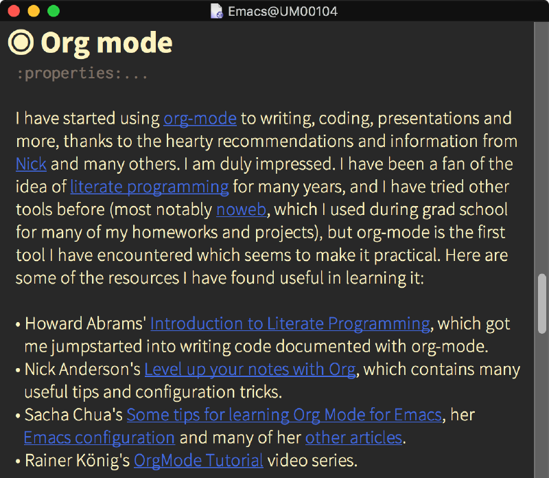
One thing you will notice right away with proportional fonts is that filling paragraphs no longer makes sense. This is because fill-paragraph works based on the number of characters in a line, but with a proportional font, characters have different widths, so a filled paragraph looks strange:

Of course, you can still do it, but there’s a better way. With visual-line-mode enabled, long lines will flow and adjust to the width of the window. This is great for writing prose, because you can choose how wide your lines are by just resizing your window.


There is one habit you have to change for this to work: the instinct (at least for me) of pressing M-q every once in a while to readjust the current paragraph. I personally think it’s worth it.
You can enable visual-line-mode automatically for org buffers by setting up another hook:
(add-hook 'org-mode-hook 'visual-line-mode)Step 4: Configure faces for specific Org elements#
After all the changes above, you will have nice, proportional fonts in your Org buffers. However, there are some things for which you still want monospace fonts! Things like source blocks, examples, tags and some other markup elements still look better in a fixed-spacing font, in my opinion. Fortunately, org-mode has an extremely granular face selection, so you can easily customize them to have different elements shown in the correct font, color, and size.
Tip: you can use C-u C-x = (which runs the command what-cursor-position with a prefix argument) to show information about the character under the cursor, including the face which is being used for it. If you find a markup element which is not correctly configured, you can use this to know which face you have to customize.
You can configure specific faces any way you want, but if you simply want them to be rendered in monospace font, you can set them to inherit from the fixed-pitch face we configured before. You can also inherit from multiple faces to combine their attributes.
Here are the faces I have configured so far (there are probably many more to do, but I don’t use org-mode to its full capacity yet). I’m showing here the LISP expressions, but you can just as well configure them using customize-face.
  (custom-theme-set-faces
   'user
   '(org-block ((t (:inherit fixed-pitch))))
   '(org-code ((t (:inherit (shadow fixed-pitch)))))
   '(org-document-info ((t (:foreground "dark orange"))))
   '(org-document-info-keyword ((t (:inherit (shadow fixed-pitch)))))
   '(org-indent ((t (:inherit (org-hide fixed-pitch)))))
   '(org-link ((t (:foreground "royal blue" :underline t))))
   '(org-meta-line ((t (:inherit (font-lock-comment-face fixed-pitch)))))
   '(org-property-value ((t (:inherit fixed-pitch))) t)
   '(org-special-keyword ((t (:inherit (font-lock-comment-face fixed-pitch)))))
   '(org-table ((t (:inherit fixed-pitch :foreground "#83a598"))))
   '(org-tag ((t (:inherit (shadow fixed-pitch) :weight bold :height 0.8))))
   '(org-verbatim ((t (:inherit (shadow fixed-pitch))))))
Update (2019/10/24): updated the settings above based on my latest config.
Update (2019/02/24): thanks to Ben for figuring out the fix to the vertical spacing issue noted below. The trick is to set the org-indent face (see above) to inherit from fixed-pitch as well.
One minor issue I have noticed is that, in variable-pitch-mode, the fixed-pitch blocks have a slight increase in inter-line spacing. This is not a deal breaker for me, but it is a noticeable difference. This can be observed in the following screenshot, which shows the block of code above embedded in the org-mode buffer and in the block-editing buffer, which uses the fixed-width font. If you know a way in which this could be fixed, please let me know!
Conclusion#
The setup described above has considerably improved my enjoyment of writing in Emacs. I hope you find it useful. If you have any feedback, suggestions or questions, please let me know in the comments.
