

After years of using a photo of the Z from a Zamboni machine as my favicon, I decided it was time for a refresh.
| Before | After |
|---|---|
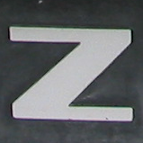 |  |
The new design keeps the Z, but gives it a cleaner, more recognizable look: two parallel strokes in white and light blue against a dark background.
I generated a few alternatives with AI, settled on this one, and prepared the different icon sizes for browsers and mobile devices.
A tiny change, but a nice improvement to my website’s identity! I’m happy to have a favicon specifically designed for this.
(note: web browsers seem to be very stubborn in their favicon caching. If you don’t see the new icon, you may have to force-reload or restart your browser)